2026

Avasthā

#

Client

Avasthā

#

Category

Web design

#

Year

2026

white and blue plastic pack

2026

Avasthā

#

Client

Avasthā

#

Category

Web design

#

Year

2026

white and blue plastic pack

2026

Avasthā

#

Client

Avasthā

#

Category

Web design

#

Year

2026

white and blue plastic pack

Avasthā is a mock team project exploring how refined design and thoughtful structure can help real estate businesses present and list their properties online with clarity, intent, and a more elevated digital experience.

Avasthā is a mock team project created to explore how real estate brands can present their properties in a more refined and intentional way online. Most platforms today feel cluttered and generic making it harder for users to truly connect with a space. This project focuses on solving that by bringing listings upfront, simplifying discovery, and shaping a journey that feels calm, clear, and purposeful. The interface follows a soft light theme with subtle blur effects across pages, creating a quiet, premium atmosphere that aligns with the brand’s tone.

Instead of relying on heavy animations, the experience prioritizes smooth performance and clarity, ensuring users can browse without friction. While the core structure reflects thoughtful design decisions, this remains an exploratory concept, some elements are pre-made, and deeper UX processes like user research, market validation, and testing were intentionally skipped because we didn't feel a strong need for that in a Mock Project like this. This project was created by me along with a fellow designer Saurjya Acharya, using Framer and AI tools like Gemini, Lummi, and ChatGPT to generate images and content.

Problem

The current situation of real estate platforms reflects a growing imbalance between visual styling and actual user experience, where interfaces are often cluttered with excessive components, generic layouts, and interaction patterns that prioritize aesthetic novelty over usability. This results in cognitive overload, weak information hierarchy, and reduced emotional connection, making it difficult for users to meaningfully engage with property listings or navigate with clarity. In parallel, a broader trend within the design industry shows an overemphasis on surface-level UI, where heavy animations, transitions, and visually impressive but functionally redundant elements are mistaken for good design, while core UX principles such as clarity, accessibility, and purposeful flow are frequently overlooked. Within this context, the challenge is not just to redesign a platform, but to re-establish what effective UX should feel like in a high-intent domain like real estate. The goal is to move away from overstimulation and toward a more intentional, system driven experience that reduces friction, strengthens content prioritization, and supports decision making. This involves creating a clear visual hierarchy, simplifying navigation patterns, and aligning interaction design with user goals rather than visual trends. Ultimately, the problem addresses a need to shift the focus back from decorative complexity to meaningful usability, demonstrating that true design value lies not in how much is shown, but in how well it works.

Goal

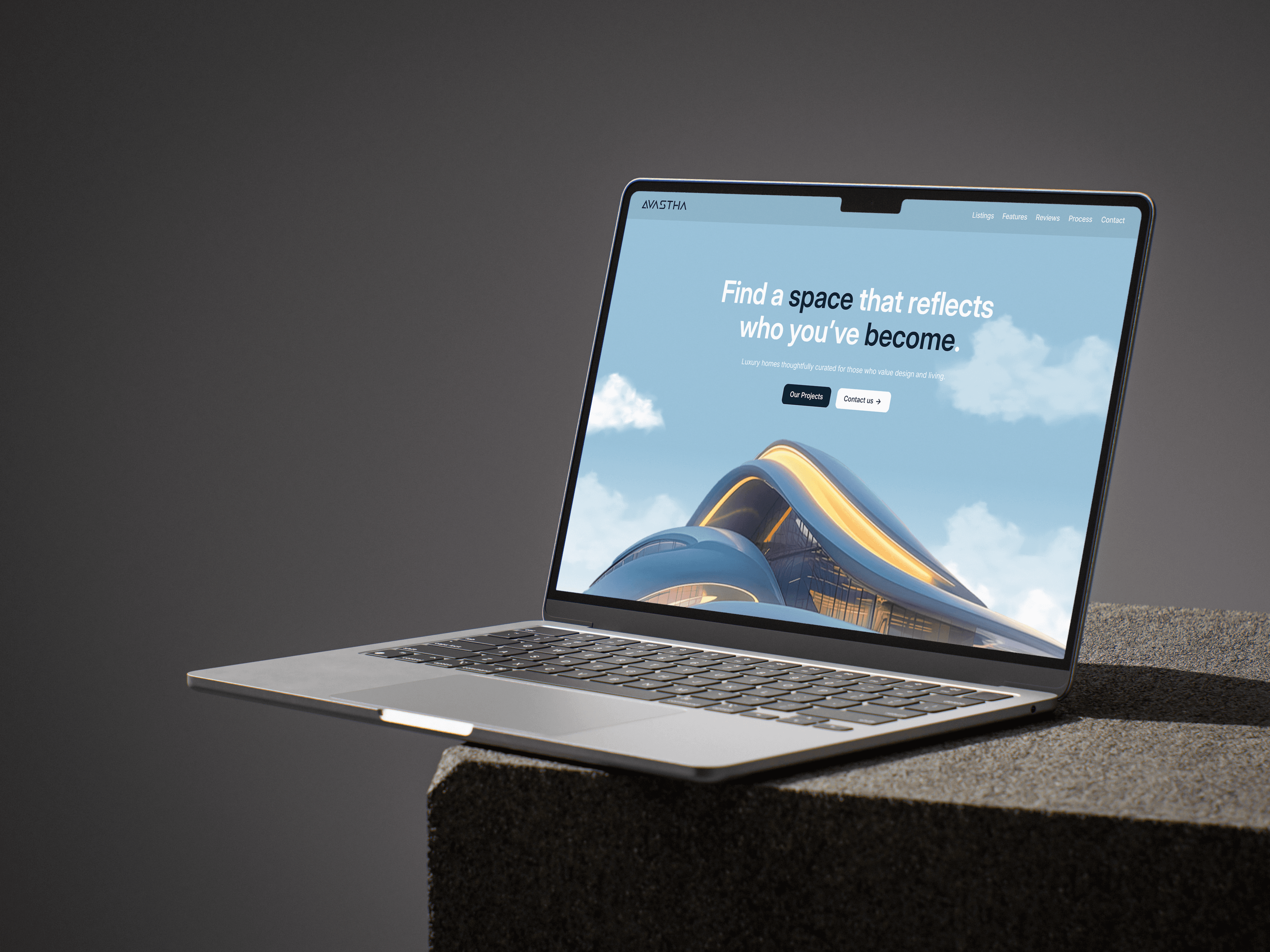
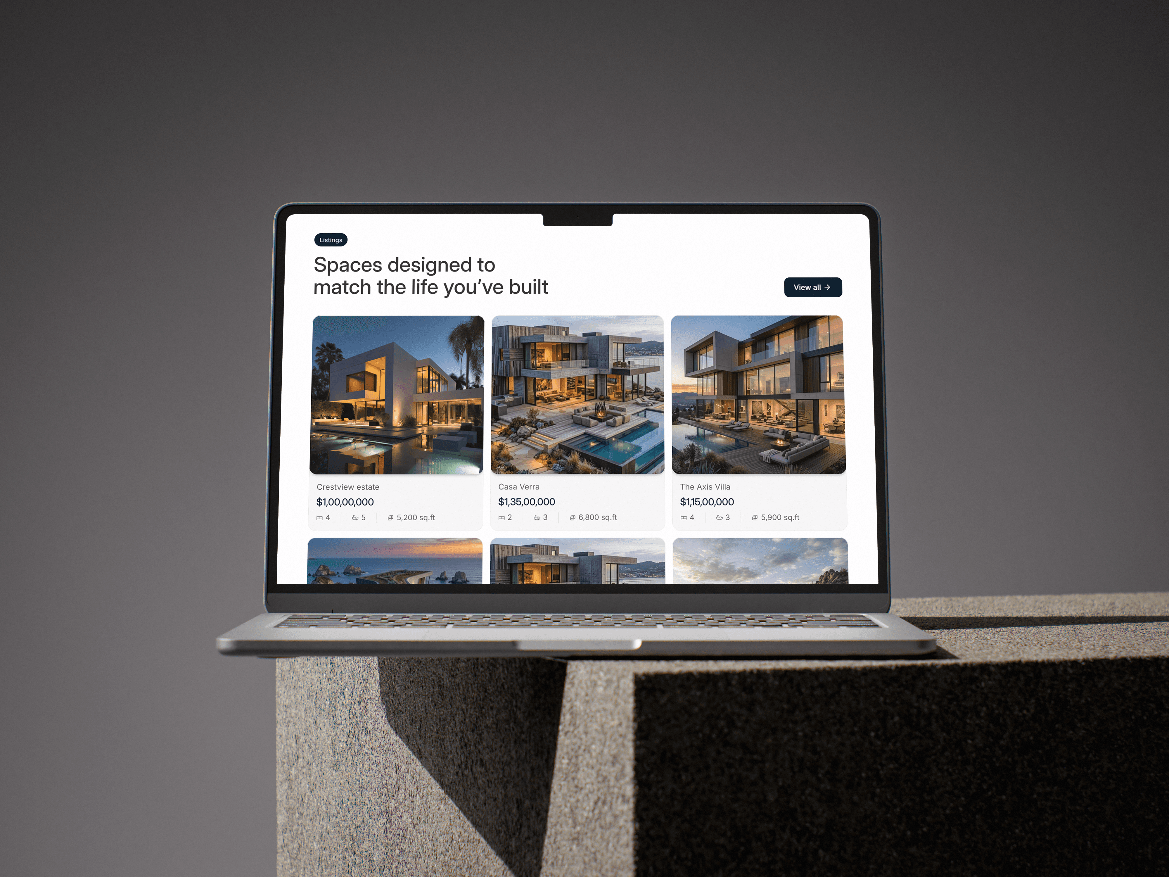
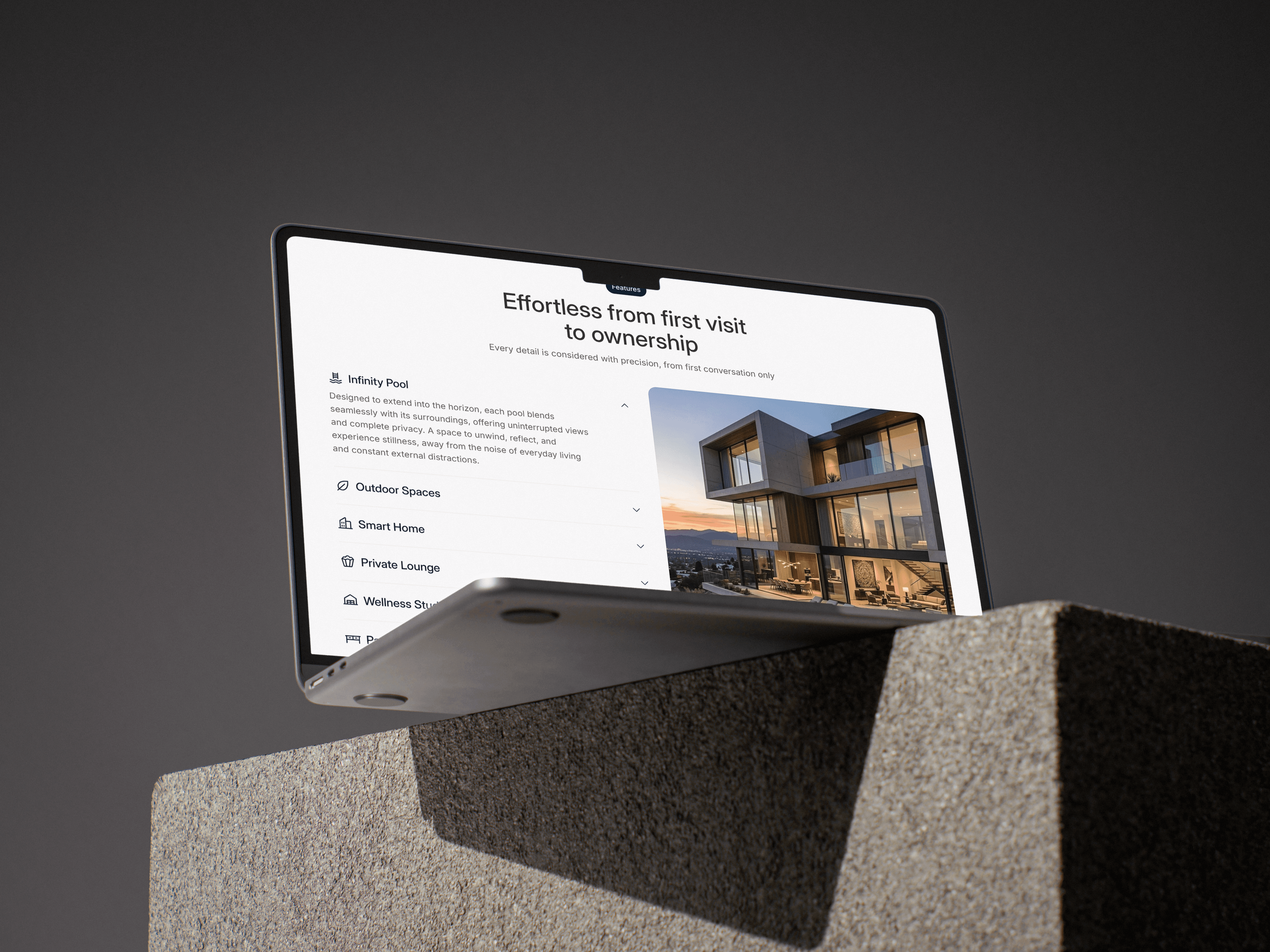
The goal of Avasthā is to redefine how real estate platforms communicate value by prioritizing clarity, intent, and meaningful user interaction over visual excess. Instead of overwhelming users with dense layouts and distracting elements, the aim is to create a focused experience where properties are presented with structure, hierarchy, and purpose, allowing users to explore and evaluate spaces with ease. By bringing listings to the forefront and reducing unnecessary friction, the platform seeks to guide users toward confident decision making while maintaining a calm and immersive browsing flow. At the same time, the project aims to demonstrate a more balanced approach to design, where aesthetics support usability rather than dominate it. This involves minimizing heavy transitions, optimizing performance, and ensuring that every interaction serves a clear function within the overall journey. Through a restrained visual language and a system driven layout, the goal is to highlight how thoughtful UX can elevate even a simple concept into a compelling digital experience, reinforcing that effective design is defined not by complexity, but by how intuitively it works.

Result

The outcome of Avasthā reflects a clear shift toward a more intentional and user focused real estate experience, where simplicity and structure guide interaction rather than overwhelm it. While the project does not rely on large scale analytics due to its mock nature, qualitative feedback from a group of 10 users highlighted consistent patterns in usability and perception. Users reported that the design naturally directed their attention to key areas, particularly the listings section, helping them understand what mattered most without confusion or effort. The overall navigation felt intuitive, allowing them to move through the platform with clarity and ease. At the same time, users noted that the experience maintained a strong sense of visual refinement without feeling excessive or distracting. The balance between a clean interface and a premium aesthetic created a browsing environment that felt both engaging and comfortable. Instead of relying on heavy effects, the design delivered a smooth and controlled interaction flow, which contributed to a sense of trust and polish. Overall, the result demonstrates how a focused approach to UX can create an experience that feels elegant, purposeful, and easy to use, even within a simplified, conceptual project setting.

More Projects

Explore More Work

Curious to see what else I've been working on?

Let’s Build Something Meaningful Together

More Projects

Explore More Work

Curious to see what else I've been working on?

Let’s Build Something Meaningful Together

More Projects

Explore More Work

Curious to see what else I've been working on?

Let’s Build Something Meaningful Together

Orange Blox

The image shows flowing shapes in iridescent hues, from deep blues and purples to vibrant pinks and oranges, creating an ethereal effect.

Nova Scene

The image shows flowing shapes in iridescent hues, from deep blues and purples to vibrant pinks and oranges, creating an ethereal effect.

Arched Pink

The image shows flowing shapes in iridescent hues, from deep blues and purples to vibrant pinks and oranges, creating an ethereal effect.

Liquid

The image shows flowing shapes in iridescent hues, from deep blues and purples to vibrant pinks and oranges, creating an ethereal effect.

Some frequently asked questions answered.

From timelines to process details, here are quick answers to the most frequent questions I get.

Frequently Asked Questions

Do you only Design Websites or Develop them too?

From where do you work?

Can you also design my Application's interface?

Do you work with international clients?

What are your average charges?

Create a free website with Framer, the website builder loved by startups, designers and agencies.