Problem
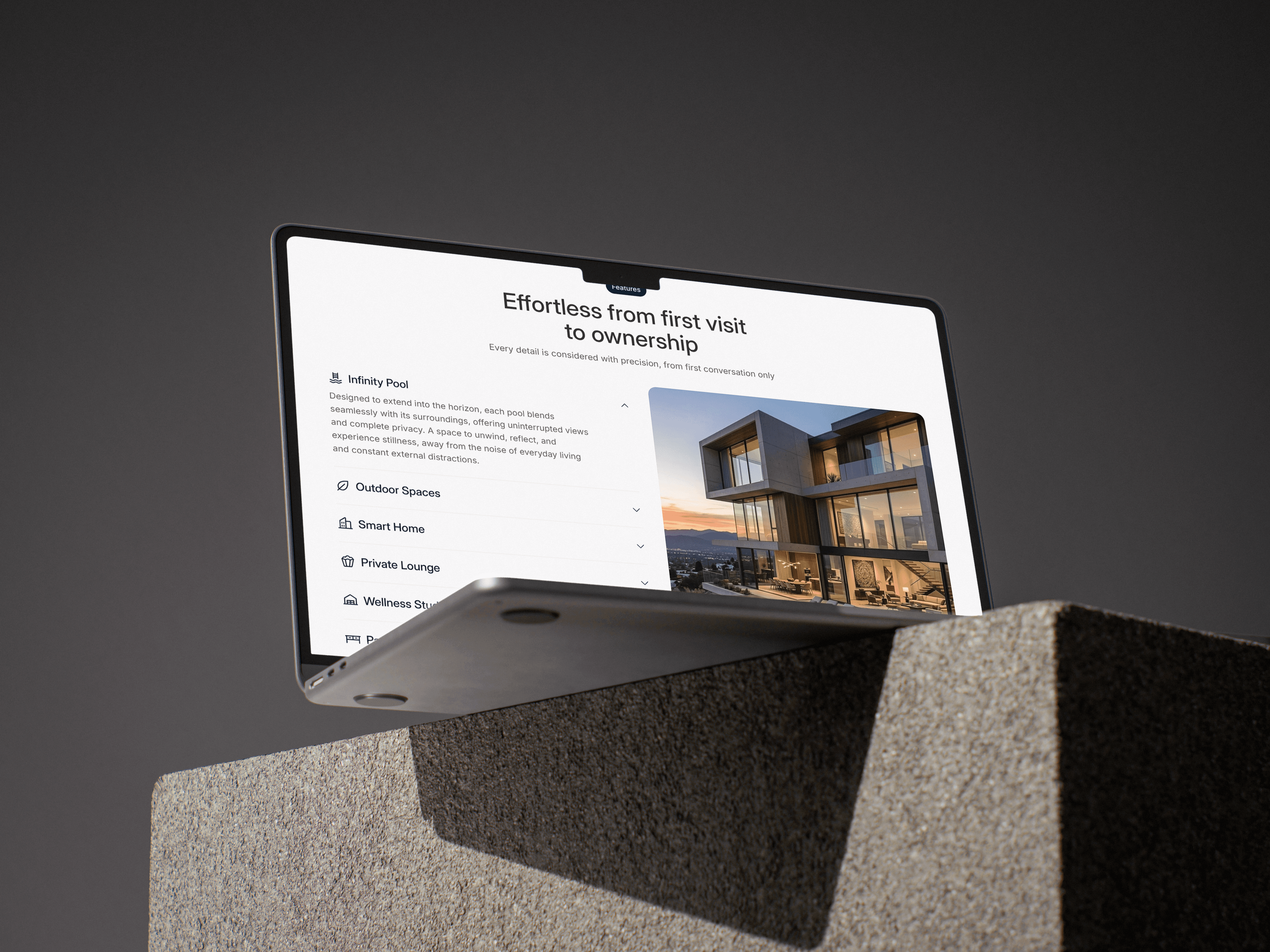
Most real estate and construction company websites suffer from the same set of problems: they either look like generic property listing platforms or outdated corporate brochures. Neither builds real confidence with a client who's about to hand over a significant construction project. Layouts are dense, navigation is unclear, and the visual hierarchy fails to guide the user toward any meaningful action. Within the construction niche specifically, the challenge is communicating a complex, multi-stage service concept, design, engineering, build, delivery in a way that feels simple and trustworthy. When a brand can't communicate its process clearly on a website, it creates friction before a single conversation even happens. The design challenge for Livon Estates was to move away from that noise and build something that feels credible, structured, and direct where a potential client lands on the page and immediately understands who they're dealing with, what they offer, and how to take the next step.

Goal
The goal of Livon Estates was to design a UI that presents a real estate development brand with the same level of polish and intentionality that the brand itself promises in its physical work while being user friendly to their target audience which is generally people between the age of 32 to 45 who are not so comfortable browsing online. The website needed to communicate the full scope of Livon Estates' services, from custom project consulting to final delivery in a single, well-structured page without overwhelming the visitor. A key design objective was building a clear visual system from scratch: a defined colour palette, a consistent type scale, and a component structure that could hold the layout together as a cohesive whole. The accent red (#F85767) was chosen to inject energy and direct attention to CTAs without disrupting the clean, light-dominant layout. Montserrat was selected for headings to bring weight and authority, while Plus Jakarta Sans handled body and UI text for its modern, readable quality. The overall goal was to demonstrate that a focused UI design approach — even without a full UX process can produce a digital product that feels purposeful, brand aligned, and ready to convert.

Result
The outcome of Livon Estates is a complete one page UI design that communicates a construction brand's identity, process, and projects with clarity and visual confidence while fulfilling our key objective of keeping the website user-friendly for the people aging from 32 to 45. One major decision to match this goal was choosingn a simple Email spaceholder instead of a detailed contact form so that the user can reach the team of Livon Estates without any difficulty. The design system established early in the project — colours, type styles, button states gave the layout a sense of consistency that holds across every section, from the hero to the footer. The wireframe first approach, even in a UI only project, helped separate layout decisions from visual ones. Working in greyscale first ensured the structure and hierarchy were solid before colour and imagery were introduced. This prevented common pitfalls like relying on colour to fix weak layouts. The final design reflects a brand that feels professional without being stiff, modern without being trendy, and clear without being minimal to the point of emptiness. It demonstrates that a well-executed UI built with deliberate typographic choices, a restrained colour system, and a structured content hierarchy can create a strong digital presence even within the scope of a conceptual mock project.